Design, Identity, and Stuff.
Spark Networks
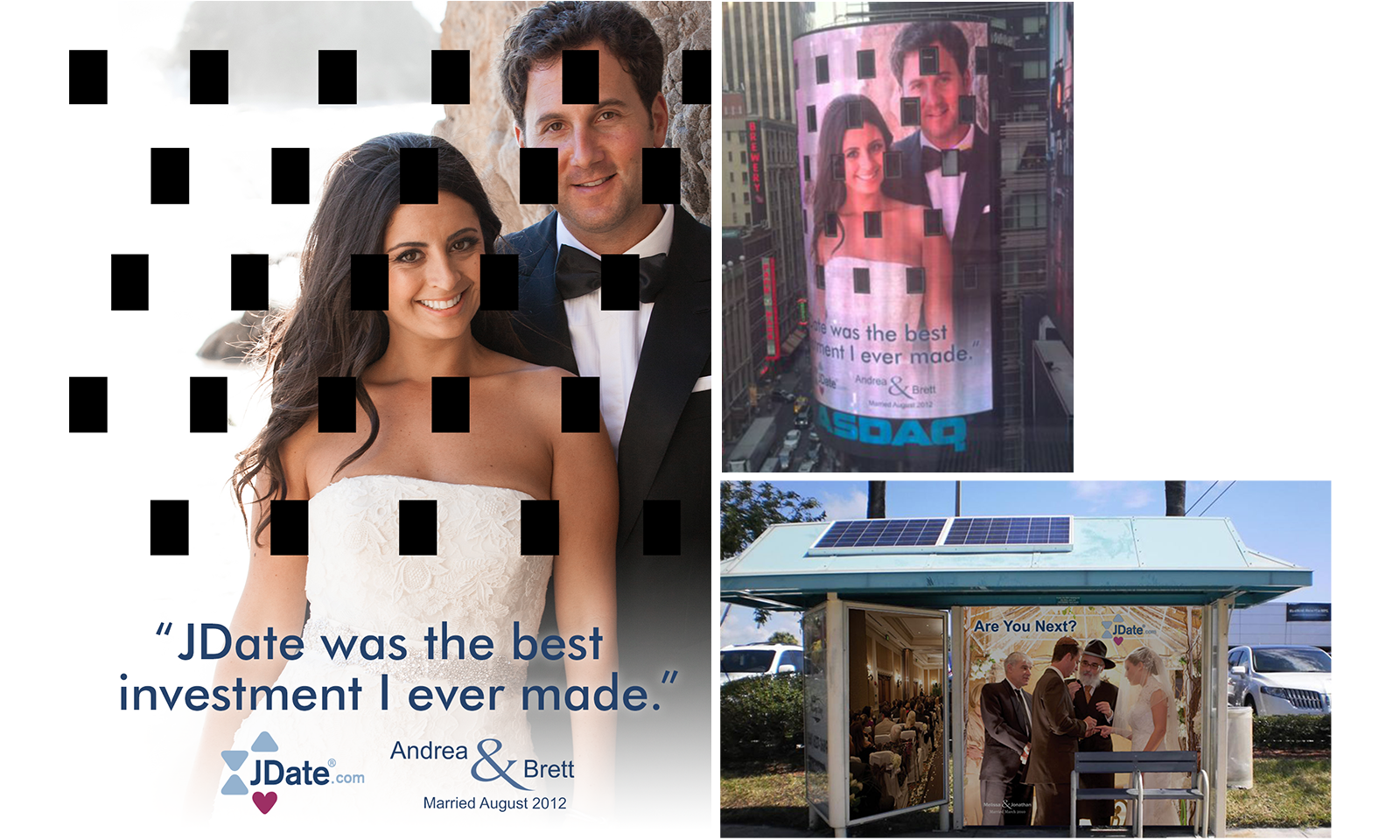
To keep our brand in the minds of our audience, I worked on advertisements from magazine ads to billboards. The two more interesting ones are below — a bus stop that brought to mind the Jewish marriage chuppah. Also, the NASDAQ billboard with all of its holes.
Responsibilities: Design | Application: Photoshop
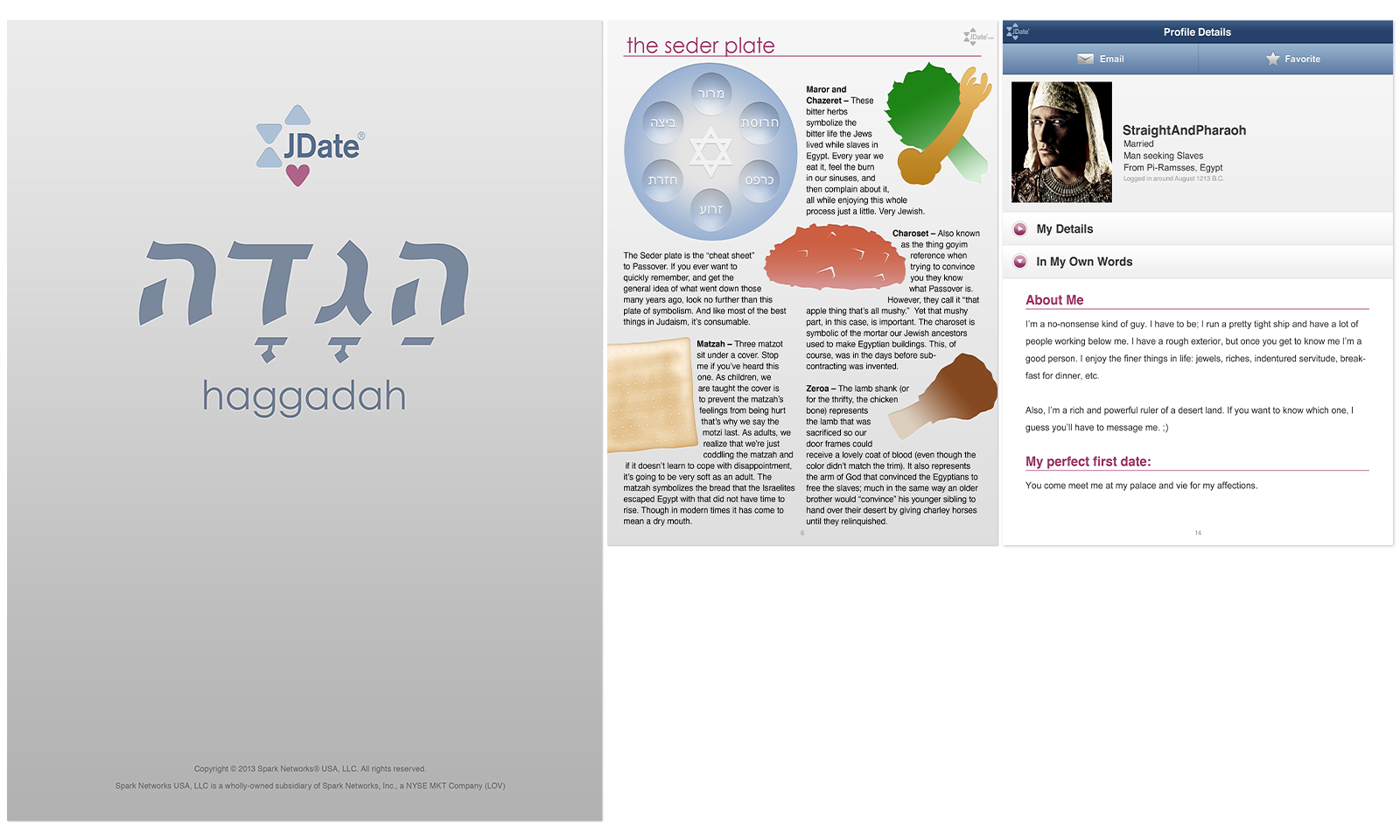
JDate Haggadah
In an effort to connect further with the Jewish community, Spark decided to create a Jewish Haggadah — the first for us. I researched how to create an iBook and ePub files as well as the social/cultural history of the Haggadah to ensure that the images matched the story.
Responsibilities: Layout, Most Illustrations | Applications: inDesign, Illustrator, Photoshop, iBooks Author, iPhoto
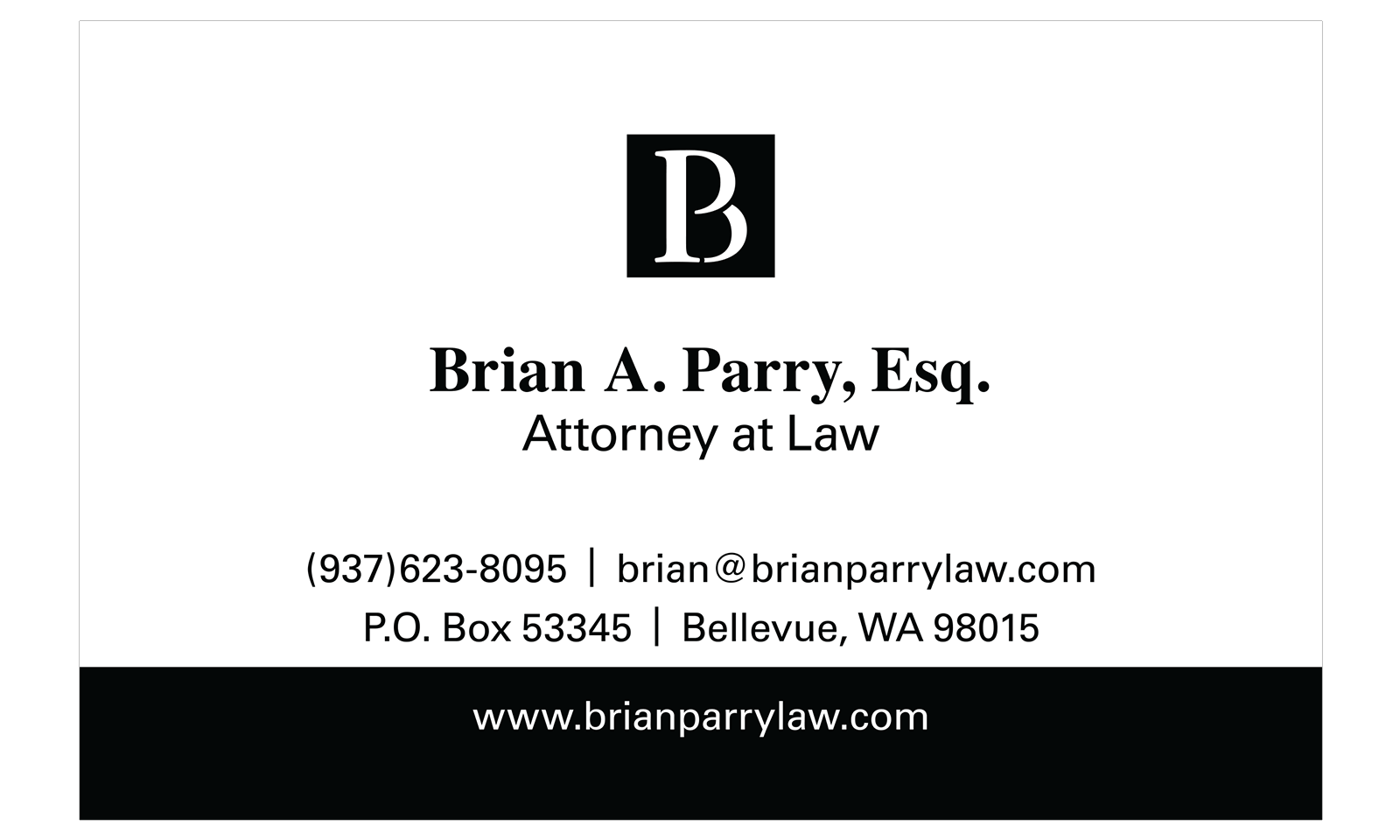
Brian Parry, Esq.
This attorney was new and just starting his career. He needed a logo and a card that spoke of professionalism, competence, and strength. However, he also wanted it to be memorable and modern. For this reason, I used a mix of serif and non-serif fonts and joined his initials, into one recognizable logo that would stand out from the other attorneys.
After discussing the goals of his logo and business card, this is the final design I came up with and delivered to the client.
Responsibilities: Design | Application: Illustrator

Digital Media Wire, Inc.
The owners wanted update their logo to a more contemporary look while keeping the same feel. They wanted the logo to represent the digital media space they covered in their industry newsletters and conferences. To this end, I shortened the logo to just the acronym and connected all the letter so they flowed into one another to represent the connectedness and fluidity of the digital media space. Also, shortening the name as such allowed us to use the logo to brand other properties without creating an entirely new one for example: DMW media, DMW events, DMW news, etc.
The Digital Music Forum East was a music industry conference where indie companies as well the established monoliths could gather and discuss the ongoings within the music industry. The logo was meant to quickly identify that it took place in New York and that it was a conference about music without having to read the entire name. The concept I came up with was to use the letter forms as buildings and to tighten the kerning so that it felt like the skyscrapers on New York bunched in together.
Application: Illustrator

Media Kit
We were using a word document as our media kit to send out to potential sponsors. In my spare time, I took what was in the word doc and put it in inDesign to create a more compelling and exciting media kit that would get people excited about our conferences.
Responsibilities: Layout, Design | Applications: inDesign, Photoshop, Illustrator

Sushi&Tofu Magazine
I managed the layout, cover design, and coordinating with writers, designers, and sales to ensure all that needed to be in was in on-time and everything was by the print deadline.
Responsibilities: Layout, Design | Applications: QuarkXPress, Photoshop, Illustrator
